File:Comparison of male and female life expectancy -world.svg
Jump to navigation
Jump to search

Size of this PNG preview of this SVG file: 512 × 407 pixels. Other resolutions: 302 × 240 pixels | 604 × 480 pixels | 966 × 768 pixels | 1,280 × 1,018 pixels | 2,560 × 2,035 pixels.
Original file (SVG file, nominally 512 × 407 pixels, file size: 85 KB)
Summary
| Description |
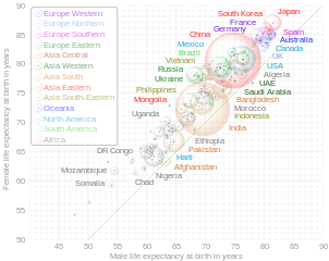
English: This is an interactuve bubble chart of comparison of countries by life expectancy at birth according to estimation of the World Health Organization for 2019. Open the original svg-file in separate window and hover over a bubble or lettering to highlight related content and to see detail information. The diagonal green line corresponds to equal female and male life expectancy. Square of bubles is proportional to the population of countries, according to estimation of the United Nations for 2019 (link 2). The diagram shows only countries with population of at least 1,000,000 people. Grouping of countries to subregions is according to the classification of the United Nations. This is a derivative work of the diagram "File:Comparison gender life expectancy CIA factbook.svg". |
| Date | |
| Source | Own work |
| Author | Lady3mlnm |
| Other versions | Russian version |
Licensing
I, the copyright holder of this work, hereby publish it under the following license:
| This file is made available under the Creative Commons CC0 1.0 Universal Public Domain Dedication. | |
| The person who associated a work with this deed has dedicated the work to the public domain by waiving all of their rights to the work worldwide under copyright law, including all related and neighboring rights, to the extent allowed by law. You can copy, modify, distribute and perform the work, even for commercial purposes, all without asking permission.
|
File history
Click on a date/time to view the file as it appeared at that time.
| Date/Time | Thumbnail | Dimensions | User | Comment | |
|---|---|---|---|---|---|
| current | 06:05, 10 June 2022 | | 512 × 407 (85 KB) | commons>Lady3mlnm | Dotted diagonal line is changed to translucent solid line. Inner structure is improved. |
File usage
The following page uses this file: